how to make a website mobile friendly
Introduction
Today, most people use mobile phones to browse the internet. If your website is not mobile-friendly, visitors may leave quickly. A mobile-friendly website looks good and works smoothly on small screens like smartphones and tablets.
In this blog, you will learn simple ways to make your website mobile-friendly
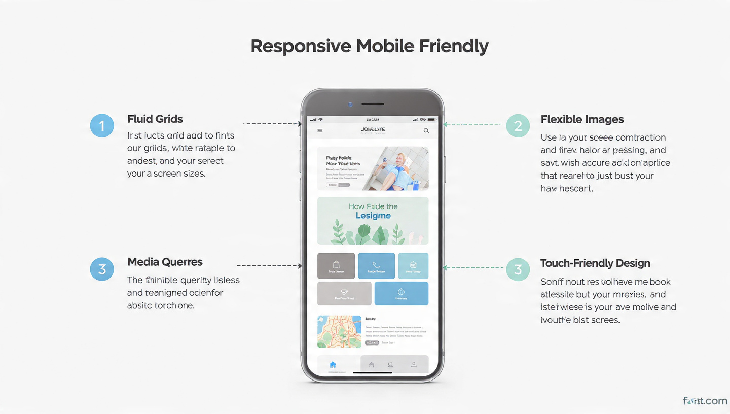
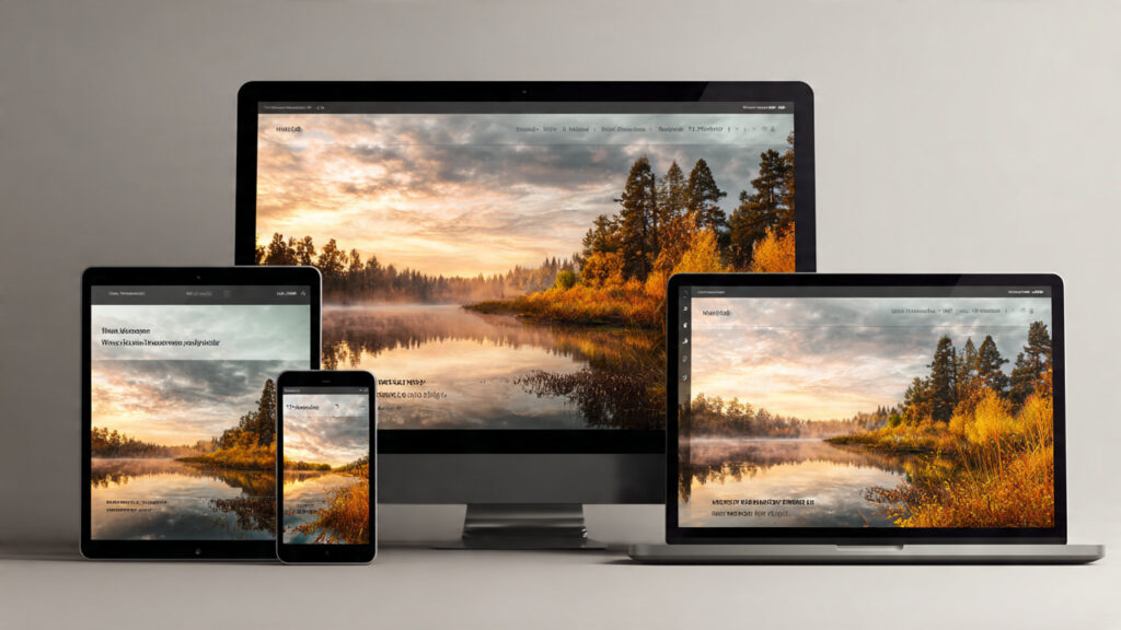
Use Responsive Design
Responsive design allows your website to adjust automatically for various screen sizes. The layout of a site will change according to the device used by the client who has requested the information from the website (e.g., mobile, tablet, desktop). This eliminates the need to create multiple sites.
Themes available on sites such as WordPress typically have built-in responsiveness so they can look different depending upon the type of device accessing them.
Choose a Mobile-Friendly Theme
Always pick a theme that is designed for mobile users.
- Clean layout
- Fast loading
- Easy navigation
Many free and paid themes are available in WordPress

Improve Website Speed
Most people on phones want pages that open right away.
Tips to improve speed:
Compress images
Use fast hosting
Enable caching
You Can Use Tools Like Google PageSpeed Insights To Check Speed
Use Large and Readable Text
Fingers squint when words shrink too much on phones. Tiny print turns reading into a guessing game. Screens demand bigger letters to stay clear. Cramped type feels like shouting from far away. Size matters most where eyes struggle.
- Use at least 16px font size
- Choose simple fonts
- Keep enough spacing

Make Buttons Easy to Click
Buttons should be easy to tap with fingers.
Use big buttons
Leave room between each button
Avoid small links
Avoid Pop-ups
Floods of pop-ups tend to interrupt people on phones.
- Use fewer pop-ups
- Close these without effort
Test Your Website on Mobile
Before anything goes live, give your site a proper check. A quick run-through now prevents bigger issues later. Mistakes slip through when you rush. Better safe than sorry – catch them early.
- Try it out across various mobile devices
- Use tools like Google Mobile-Friendly Test
Use Simple Navigation
Make it easy for users to find things.
- Use menu (☰ icon)
- Keep menu short
- Add search option
Conclusion
A website that works well on phones matters more than ever now. When people find it easy to navigate, they stay longer – search engines notice that too. Browsing feels smoother, visitors grow, visibility climbs as a result.
Follow these simple steps:
Use responsive design
Choose the right theme
Improve speed
Make text and buttons easy
Test your website